Software design beyond the process-schamans
By arvid, 2024-03-22
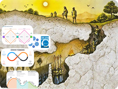
Step out of the cave
Most educational material aimed at Software Designers talk about process. One week sprint this, two diamonds that. A lean process, an agile framework. Arrows. Lines. Boxes. And colours, lots and lots of colours. This is the wordcel version of design. It talks about design. It uses words in attempt to describe what happens when someone designs something. And yet, it is not really about design.
In fact, many of these frameworks were actually never meant for designers. Nobody might have told you, but these processes that seem so baller were — actually — meant to explain design to non-designers. Mainly for companies wanting their staff to participate in a form of creative LARPing. While this might have some value for corporate managers wishing that their staff would be a bit more innovative, customer-centric, or perhaps just a little less bored, it is very different from what designers should learn to become better at their craft.

3 books to actually develop as a UX designer
To reach further and become stronger in the design craft, you don't need yet another process. That's far too superficial, too concerned with the order of the content, and too little concerned the content itself. Following these processes in extraordinary detail can still render poor results.
What's needed is mostly practice. And a bit of inspiration. Hence, I suggest the following three books.
Zen and the Art of Motorycle Maintenance, by Robert Pirsig
Exploring quality and how the western division between rational and aesthethical can be undone. Useful for getting your thinking beyond the tedious "my taste is this, and your's is that, and it is ok that it is different" that easily comes by when you still believe that there isn't an objective, and sometimes attainable, quality in the work you do.
The visual display of quantitative information, by Edward Tufte
This book should be a mandatory read, including a quiz to show that you've actually understood it, for anyone tyring to open powerpoint or excel for the first time. Tufte shows us what data visualisations actually are, and while some manage to distort a message by showing 5 poorly chosen data points in an ugly graph, others show 30 000 points to create something beautiful and insightful.
Creative Selection, by Ken Kocienda
This is the ultimate anti-thesis to all design processes and workshop methodologies that we've seen the last years. And you'll know that it works, as the results of the work are some of the best software designs of our day. While developing the keyboard for the first iPhone, at one point, the author used a whiteboard for a quick session. The rest of the time, it was work, demo, work demo. Simple and pure.